14, January 2026
|
Alternativeui library
12 Neobrutalist Websites You Should Know in 2026
Two of the most popular neobrutalist UI libraries are neobrutalism.dev and retroui.dev. But since neobrutalism.dev is no longer maintained, RetroUI is clearly the way forward.

DA
Dov Azencot
@DovAzencotBored with the same old "clean" layouts? I’m too. That’s why I’ve gathered 12 examples of neo-brutalist web design that throw standard UX out the window. Neobrutalist web design helps designers and developers build websites that look different and stand out.
List of Awesome Neobrutalist Sites:
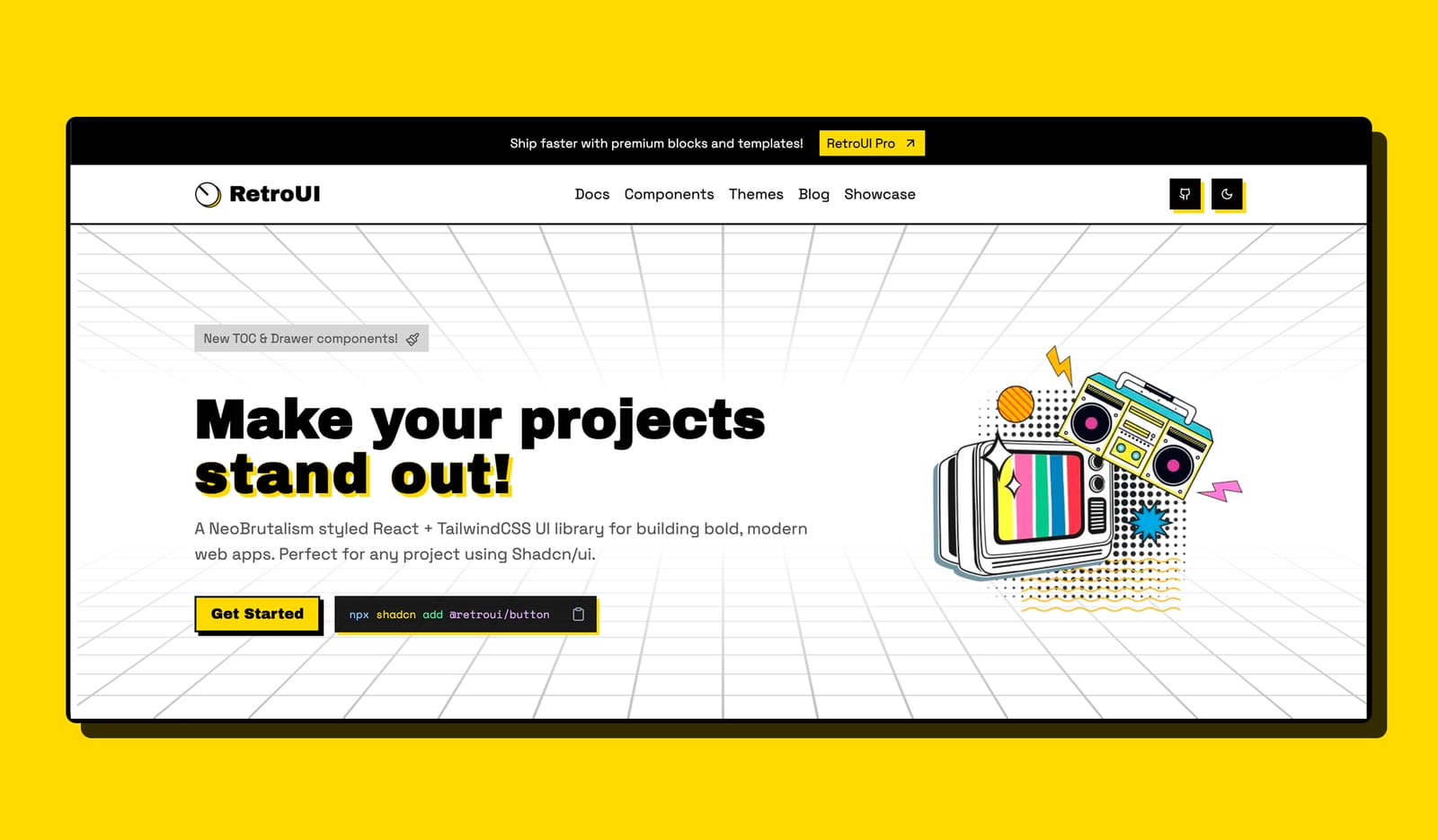
1. RetroUI
RetroUI, a neo-brutalist styled UI library that unapologetically embraces bold design. So you will immediately notice bold typography, vibrant and high-contrast colors, and thick, dark shadows everywhere.
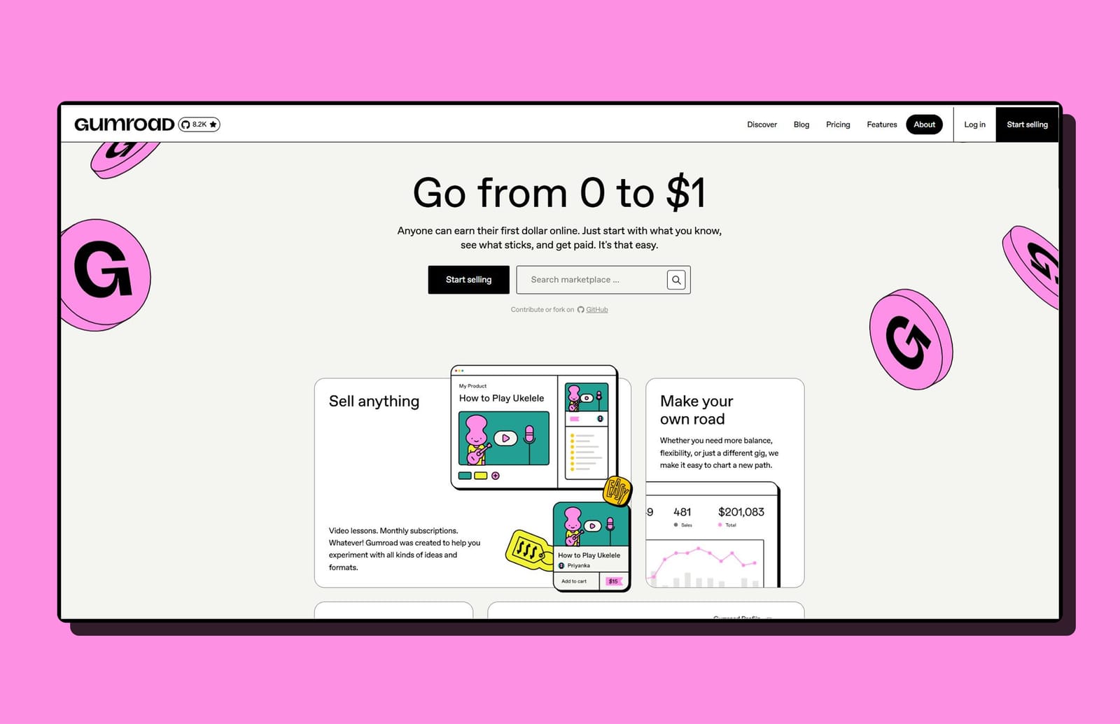
2. Gumroad
Gumroad lets creators sell their products online. I’m impressed by its bright colors and illustrations, highlighting that a marketplace can look good without the usual “slick” design.
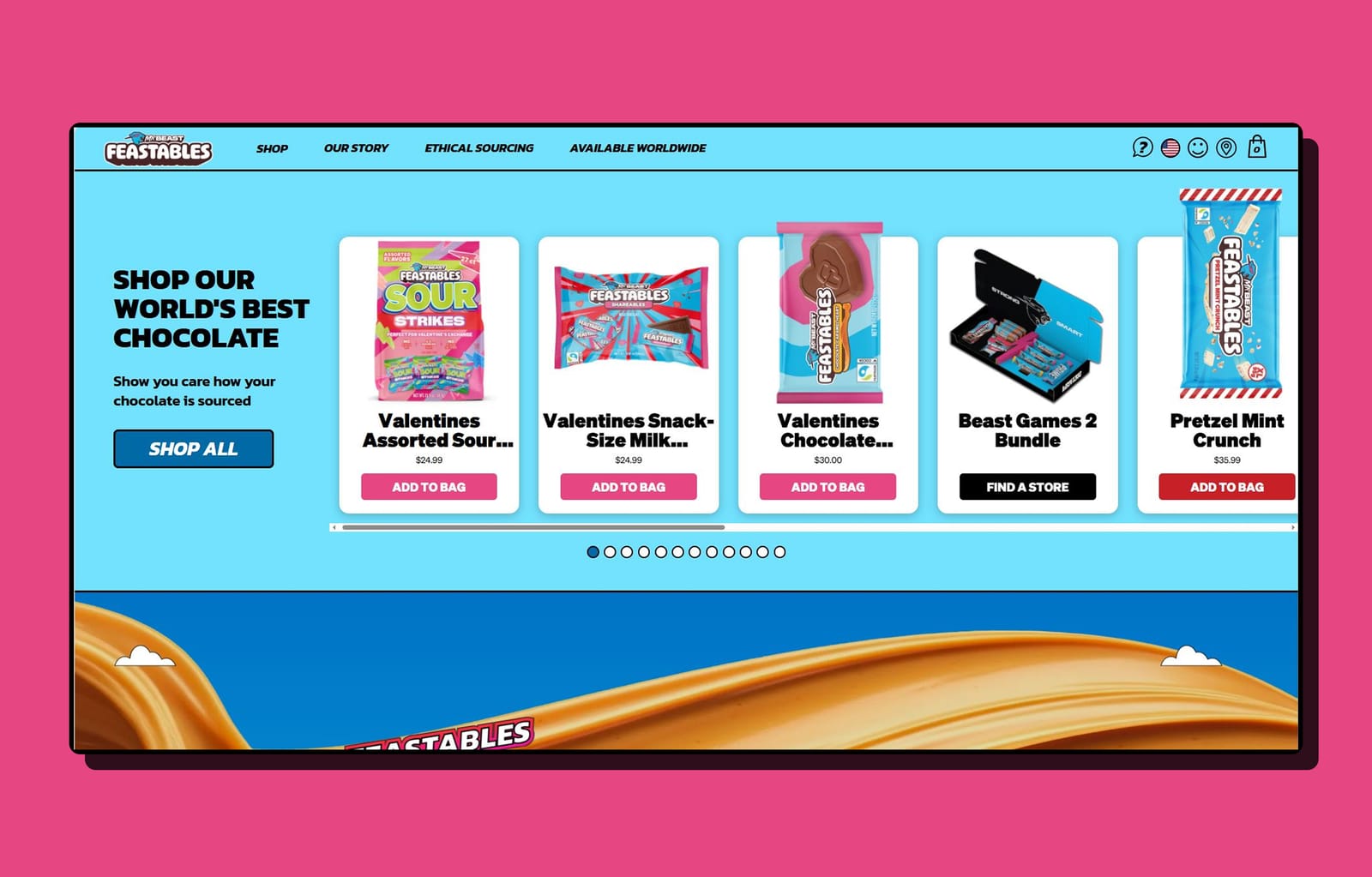
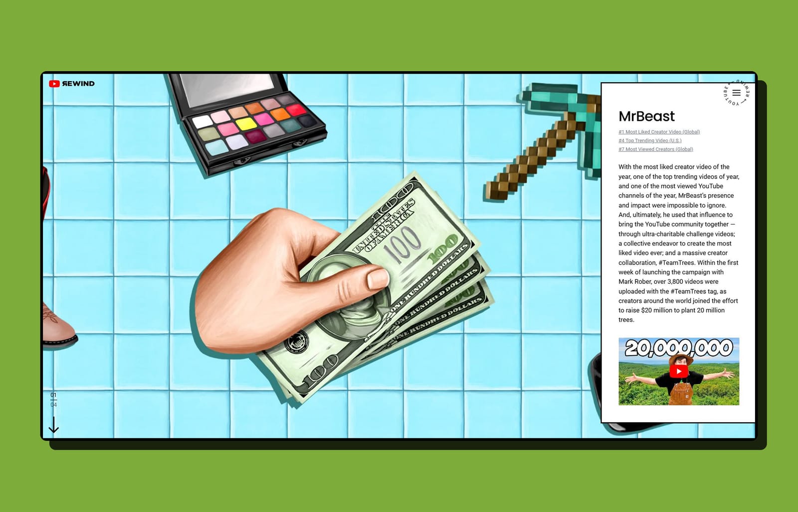
3. Feastables
MrBeast’s snack brand uses neobrutalism to connect with a younger, Gen-Z audience. The site features bold, chunky buttons and sticker-like graphics, creating a high-energy, tactile feel.
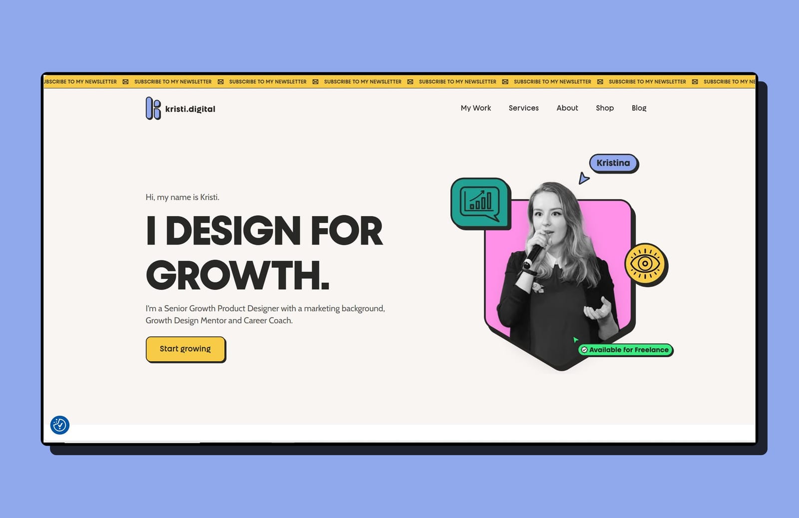
4. Kristi Digital
Next, Kristi Digital is a simple and straightforward portfolio website. The navigation is easy, and everything feels neatly organized.
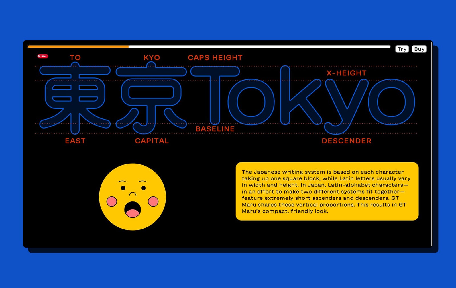
5. GT Maru
This site is a great example of how to use animation well. The neobrutalist design makes the animations clear and meaningful.
6. Rewind
Rewind lets users explore the past through a mosaic grid that feels like a real collection of memories.
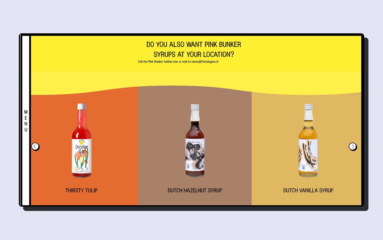
7. Roze Bunker
This Dutch drink brand uses bright neon colors and a bold layout to showcase a DIY-inspired neobrutalist style.
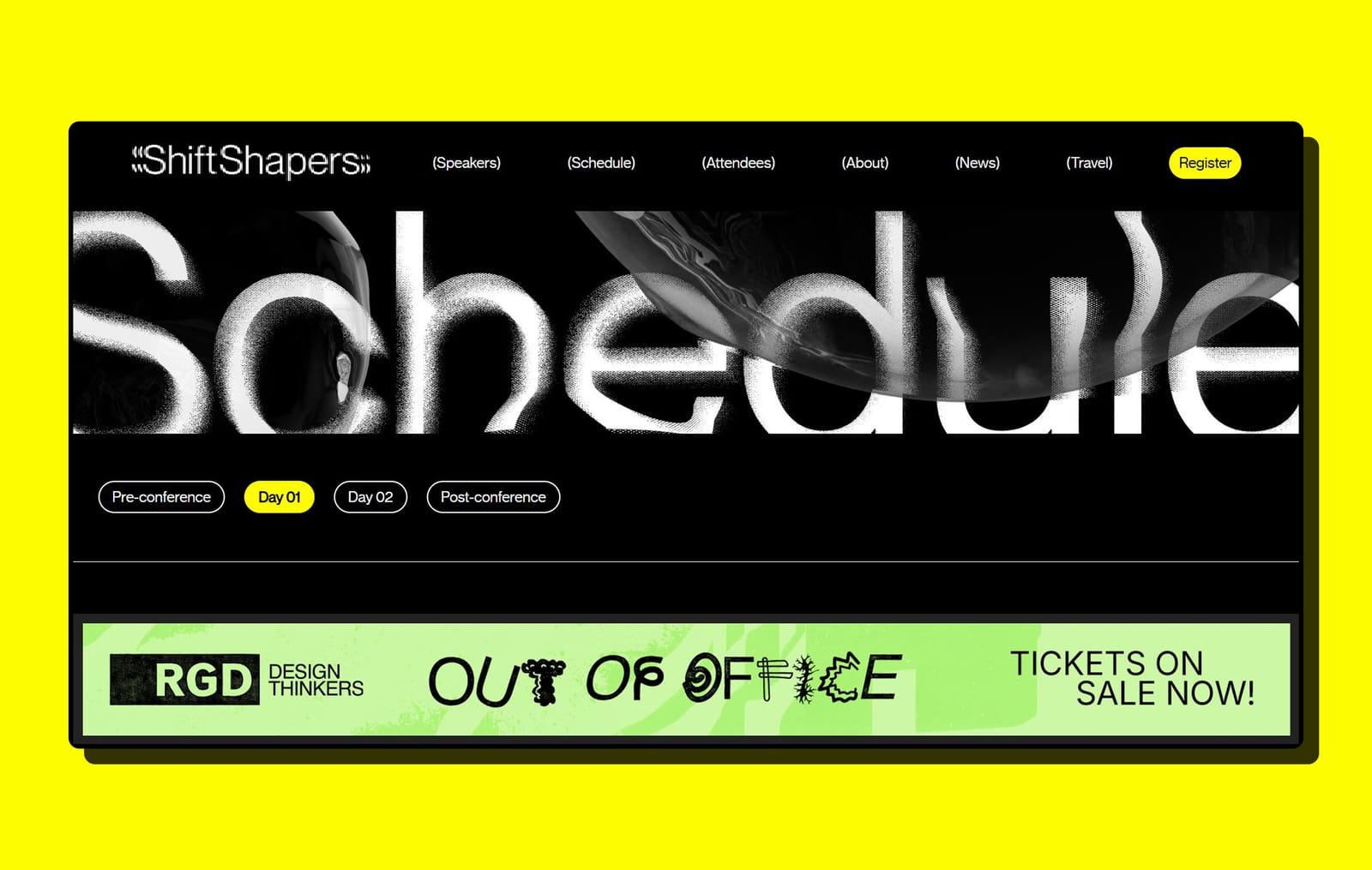
8. DesignThinkers
Next up is the official website for RGD’s annual design conference. It uses bold typography, clear sectioning, and high-contrast layouts to present speakers, schedules, and event details in an organized and accessible way.
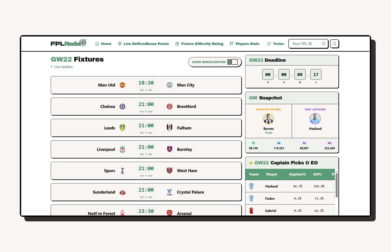
9. FPL Radar
FPL Radar, a data-heavy site for Fantasy Premier League fans. It uses neobrutalism to make complex statistics more readable by boxing them into high-contrast cards that pop against the background.
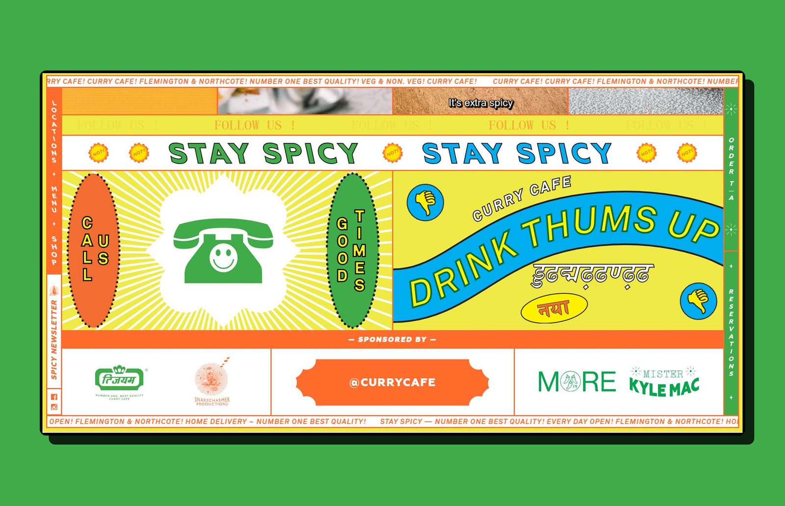
10. Curry Cafe
Next up is Curry Cafe, an Indian food website designed in a neobrutalist style. It breaks traditional design rules and may feel challenging to navigate at first, but the bold design makes it memorable.
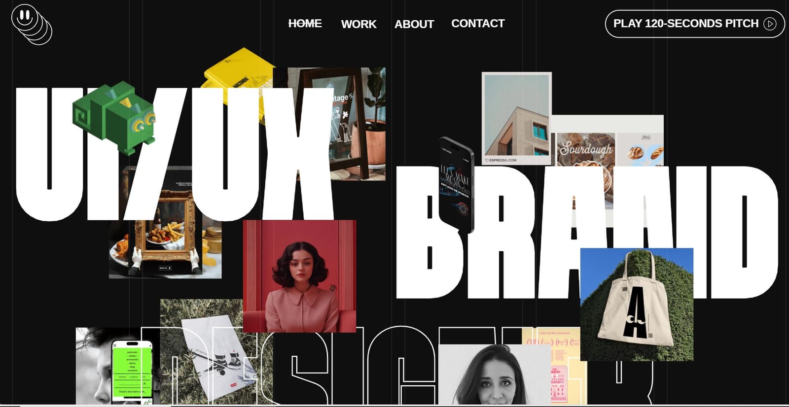
11. Lydiaamarush portfolio website
There’s the portfolio website of Lydia Amaruch, a UI/UX and brand designer from Germany. The site is highly engaging, featuring interactive, animation-heavy elements that make browsing enjoyable.
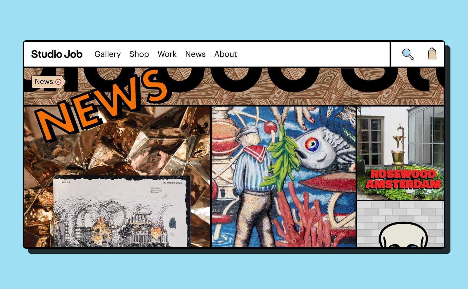
12. Studio Job
The site presents Studio Job’s work like a digital exhibition, using bold visuals, and raw typography in a neobrutalist style.
Conclusion:
And that wraps up a showcase of some of the best neobrutalist websites out there. If you’re tired of regular templates, neobrutalism offers a bold and playful alternative. These sites are fun, unique, and full of ideas that can inspire you to think outside the box in your own designs.
← Back to blogs